
Romana Romanyshyn, Andriy Lesiv


Romana Romanyshyn, Andriy Lesiv
Every time we’re inspired by the delicate sense and artistry of Lithuanian designers and illustrators, their ability to work with semitones, space and dynamics of a book, attention and respect to materials, technique, and immersion into the book’s theme. There’s always much love to their culture and history in their projects.
There’s our try to choose some of the most interesting, in our opinion, editions that demonstrate a different approach to creating a book. This list is by no means exhaustive. Many people who we truly admire are not on the list, but we would really like to name them. These are Kęstutis Kasparavičius, Birutė Žilytė, Aušra Kiudulaitė, Lina Dūdaitė and many others. We hope that this review will be a starting point that will encourage you to discover the beauty and esthetics of Lithuanian visual books.
We invite you to this journey. Let’s go!
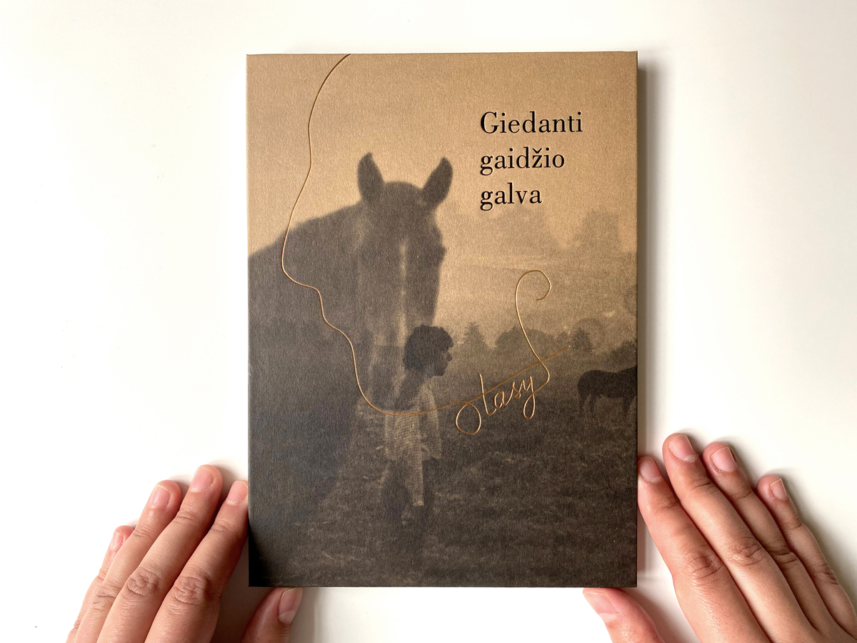
“Giedanti gaidžio galva” (“Rooster’s Head That Sings”) is a second collection of poetry by Stasys Eidrigevičius, a prominent Lithuanian artist and author, illustrated with his own drawings and photographs, and also materials from his family archive. This edition is poetry in its broadest sense, which means poetry lies not only in texts, but also in carefully chosen images and photos, subtle, thin, like a spider web, drawings, golden and sepia color scale… All this is enhanced with typography, scale, the proportions of the layout, textures of paper and perfect polygraphic evocation. Some pages are shortened by hand and edges are torn to create an impression of man-made and soleness of an edition. As if to uncover the soul of the book, the spine is left open. This book is art from the highest shelf.
Such a lyrical composition of a book is a credit to both author and designer of the book — Sigutė Chlebinskáitė — a star of Lithuanian book design. Sigutė’s method is a thorough exploration of a topic, multi-level reading, respect to the author and their creative work. Just like a lighting designer she lightens the most important things on stage.
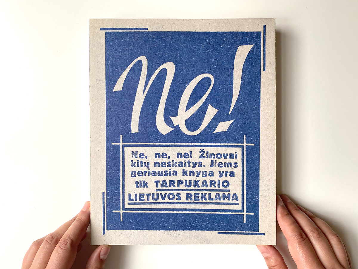
Ramūnas Minkevičius, marketing specialist and historian, prepared and published an exhaustive visual research “Lithuanian advertisement of the mid-war period”. Compiler describes his book as a paper time machine that brings a reader to a mid-war period when Western brands came to Lithuania and the market was filled with ads of different goods and services. Together with ads of today famous Lithuanian brands such as chocolate factory Rūta, pharmaceutical company Sanitas or textile manufacture Drobė, in the mid-war period Lithuanians saw ads that called them up to purchase cars by Ford, Fiat or BMW, fuel them at Shell filling stations, while drinking Pepsi and listening to radio manufactured by Phillips.
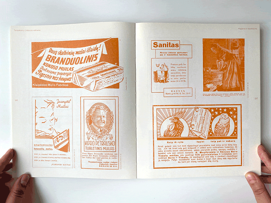
A book by Ramūnas Minkevičius has a distinct structure and offers a wide insight about Lithuanian advertisement graphic design of the mid-war period. The compiler had a mega difficult task: place very different advertising images under one cover and keep the integrity of the edition. To understand how hard it is, just imagine — or rather — look at the streets of the majority of our cities where several signboards press on top of one another trying to “outshout” a neighbor and burn the customer’s retina with a spectrum of synthetic colors. Something like that could happen with such a collection of various ads, but designers Laura Klimaitė and Miglė Rudaitytė managed to find a brilliant design decision — generalize the color scale to several monochrome shades. On one hand, this is a stylization of monochrome ads, printed on mill, on the other — a particular ploy to gather together the material that belongs to different styles.
The book has twenty chapters, which are divided by color and there’s a chapter at the end of the book where we see ads in full color.
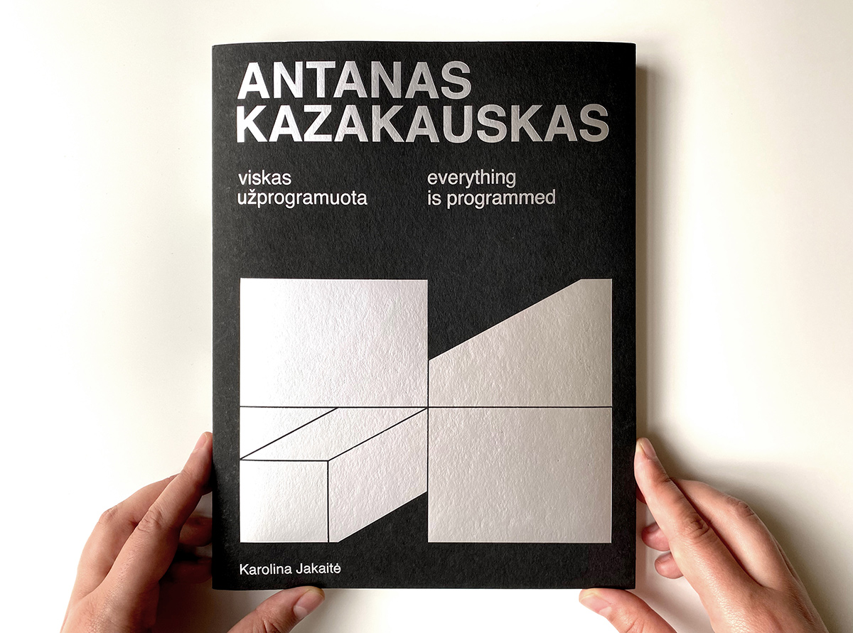
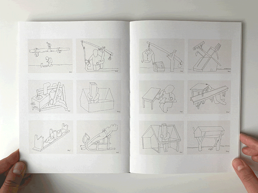
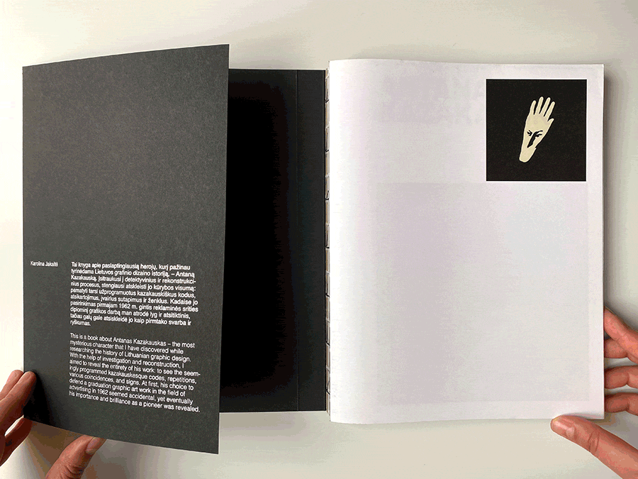
“Viskas užprogramuota” (“All programmed”). This phrase is a key to understanding an individual philosophy and personality of one of the most interesting and, at the same time, one of the least known graphic designers of Lithuania — Antanas Kazakauskas (1937-2019). A thorough study of Kazakauskas’s professional activity and creative heritage has been conveyed by researcher Karolina Jakaitė. Antanas was a very non-public person, and an enormous quantity of his works was unknown to the public up to his death in 2019 and is published for the first time in this study. Karolina Jakaitė has led several interviews with Antanas Kazakauskas and had his permission to work and research his works by directly working in an artist’s atelier with the originals. She also had the author’s permission to publish his works of various genres for the first time, and they became the basis of this edition.
This book is a brilliant example of monographic research of an author’s creative work who engaged himself in graphic design of ads, creating books, and posters. He too was a designer of a natural science magazine Mūsų gamta for years, where he constantly showed his experimental designer character. This book is a fantastic source of inspiration for modern graphic designers and artists.
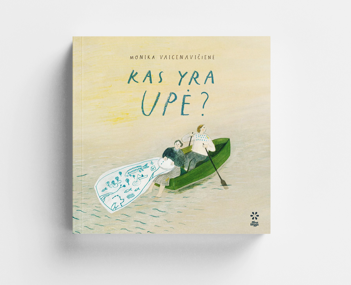
“Kas yra upė?” (“What is a river?”) is an illustrated book, philosophical and poetical non-fiction, written and illustrated by Monika Vaicenavičienė, an artist and author.
A grandmother and her granddaughter are resting on the bank of the river. The grandmother is embroidering and the girl is picking some flowers and asking: “What is a river?” This simple question is a turning point for a deep and complicated talk about the nature of the river, its timelessness, connection to humans, and its symbolic meaning. At the same time the grandmother’s narrations about the nature of the river is like an embroidered blue thread on fabric that is covered with new embroidered images. Fiction text entwines with scientific facts and subtle illustrations, creating a solid canvas.
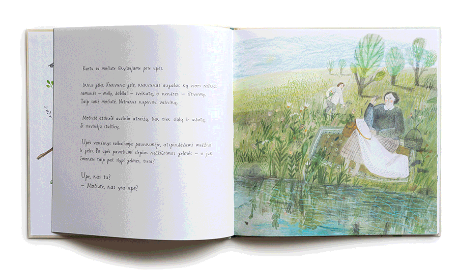
Illustrations, created with aquarelle, crayon and coloured pencils, perfectly convey river nature vibes, its current, mirror water surface and, at the same time, its depth. This book is pervaded by a clear feeling of airiness. You want to dive in it, jump into the soft water of the river and enjoy the meditative fluidity of history.
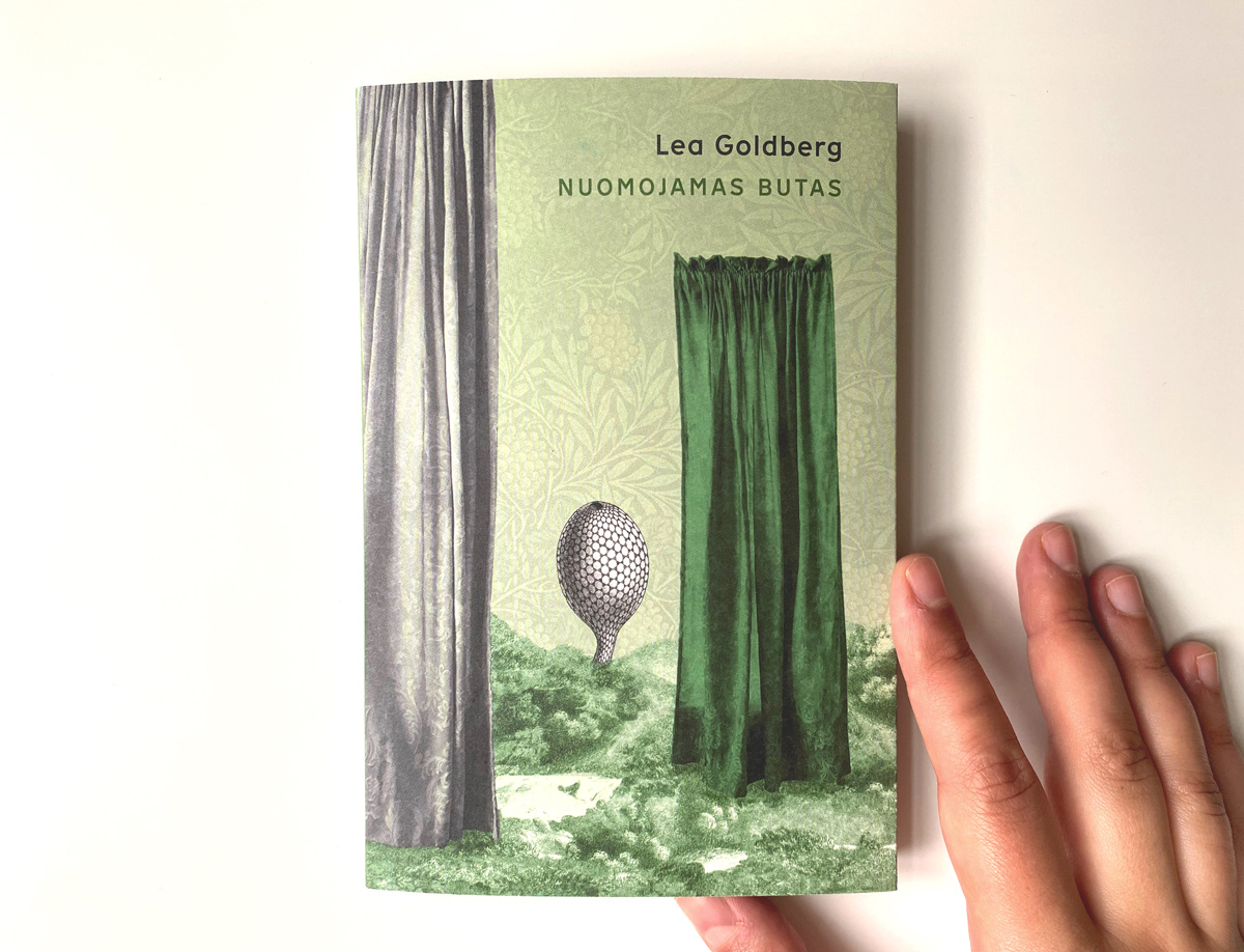
Lea Goldberg, Israeli writer, translator and scientist, was born in Königsberg in a family of Lithuanian Jews, but she spent her childhood in Kaunas. A fairy tale in verse “Žalias kalnas” (“A Flat for Rent”) is one of the most known works for children by Lea Goldberg, translated into many languages. The story is about a house with five floors, each with its own apartment, where different animals live: a hen, a cuckoo, a cat and a squirrel. A flat on the upper floor is to be rented out because a mouse, who used to live there, left the apartment without saying a word. Animals come to see the free flat so they could move in, but despite the fact that they truly like the flat, they do not like some of the neighbors. Later on, someone who didn’t really like the flat absolutely loves the neighbors and is happy to settle in the new flat. At the end of the day, everyone lives happily ever after, and that is a fairy tale and model for how the world should be.
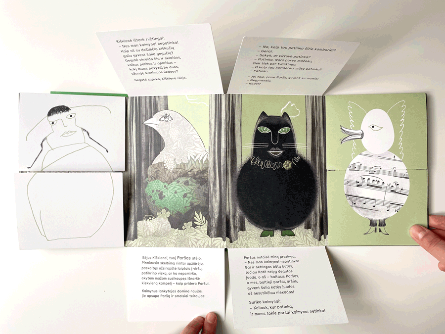
This book is yet another masterpiece by an artist and designer Sigutė Chlebinskáitė. She has found inimitable form to realize this story. With an elegant and attentive approach which is characteristic of her, the artist created an interactive book-game, combining the leporello folded style with hinged sides on every page. Reading turns into a pure adventure and every single time you look through the book you see new, earlier unnoticed details of illustration or design. Illustrations carefully connect archive photos, the author’s paintings, fragments of old floristic engravings and patterns by William Morris. All these elements create a nostalgic atmosphere of an old interior with antiquarian furniture while the greenish scale of color binds a complicated visual construction together. For bibliophiles this is an unbelievable treasure of a book!
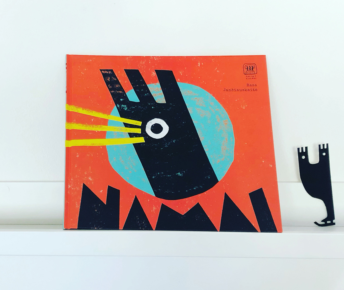
“Home” is a picture book for children by author and illustrator Rasa Jančiauskaitė.
The story is about the journey of an unusual snail who carries its home on its back and on its way meets various animals who live in their weird houses, adapted precisely to their needs. A bird in a nest, for instance, bees in a hive. A conceit of a home, according to the author, symbolizes the inner world of a hero, personal space and its boundaries.
A zest of the book is in illustrations. The artist works boldly with distinctive and contrasting forms, bright colors, rhythms and textures. Rasa stylizes animals in a very curious way, masterfully working with abstract stains and text composition.
Not so far ago the book received brand new embodiment — Ieva Jackevičiūtė, a director, staged a play, inspired by a story and illustrations from a book “Home,” in Menas theater in Panevėžys (a city in Lithuania). This play is meant to meet the needs of people of a wide age range; the play is interactive, and audience with babies and young children are invited to participate.
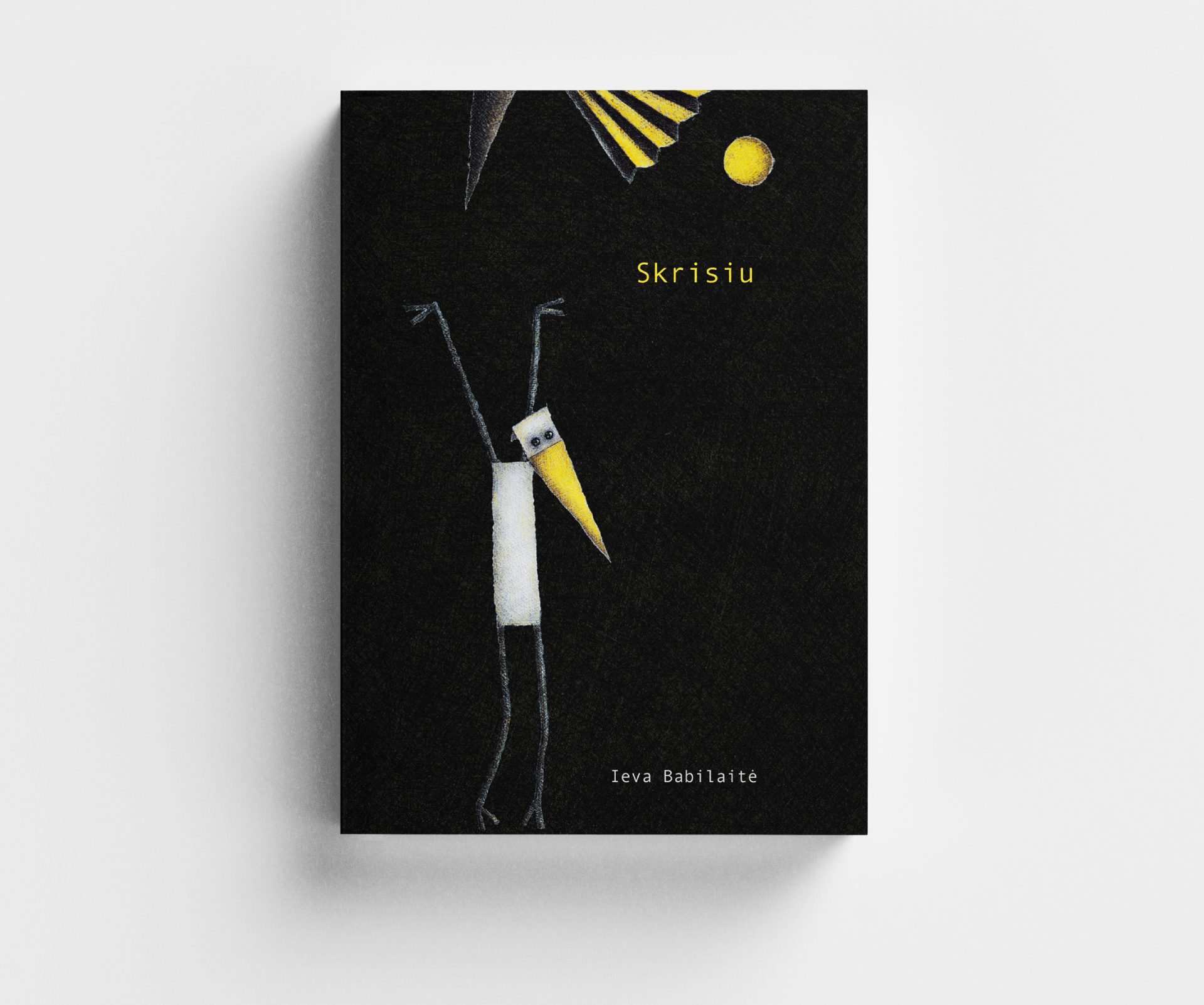
Ieva Babilaitė is an artist, working with many media and techniques. Books are only one of her creative voices, together with graphics, paper sculptures and theatrical art.
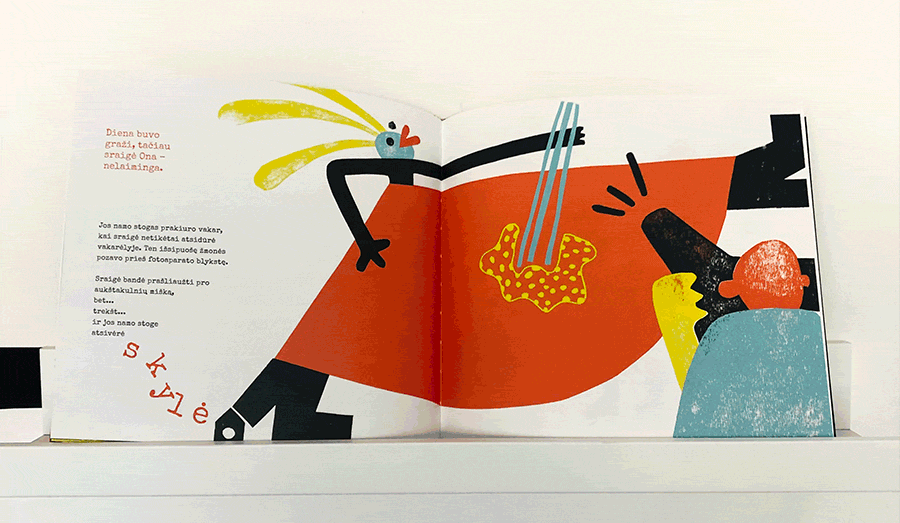
The book “I will fly” tells a story of a bird, born without wings, that despite this strives to fly and doesn’t stop in the face of difficulties.
In this edition allusions to stylistics of theatrical decorations and the artist’s paper sculptures are clearly seen. The main character greatly resembles a theatrical puppet in its stylization, and that is one more thread to theater.

In her book, Ieva experiments with different papers — lucent pieces of tracing paper add a sense of airiness and lightness, holes cut in the pages are like windows to future adventures. Pages are overlapped, winged, folded as fans, turned into steps that go to multilevel plot. Pages of the book rustle… has the paper bird flown away?
Marius Jonutis is a very multifaceted artist. He is engaged in drawing, sculpture, graphic design and illustration.
We have always found the works of artists who work in different media quite impressive because their works combine characteristics, principles, and technical methods from all the mediums they have mastered so far. Such flowing over from genre to genre generates the most incredible works of art.
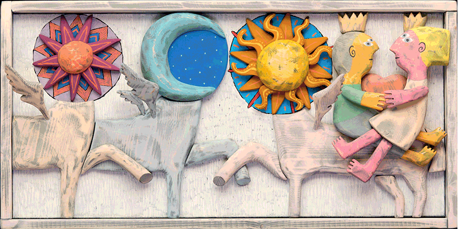
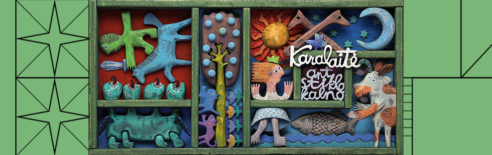
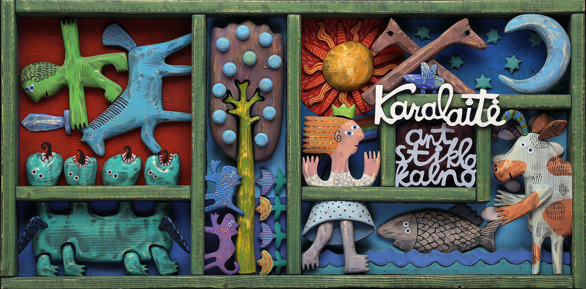
“A Queen On A Glass Mountain: twelve of the most beautiful Lithuanian fairy tales, and one more” is a collection of thirteen of the most famous fairy tales in Lithuania, collected and compiled by Jūratė Šlekonytė and Gytis Vaškelis, adapted for a modern reader by Danutė Kalinauskaitė and illustrated with the works by Marius Jonutis.
Works by Marius are volumetric sculptural painted panels, photographed and used in the book as illustrations. The artist created more than 70 volumetric and carved from wood polychrome figures and elements. These images create a unique visual accompaniment to the texts of ancient fairy tales well-known to almost all Lithuanians. Even drop caps — initial letters of each fairy tale — are made of wood using the same technique.
The stylization of the images is deeply rooted in folklore, and this can be read both in the interpretation of the characters and in the stylization of ornaments and auxiliary elements.