* ESC - close the search window
ornaments
Ukrainian identity in graphic design: Code decoding
31.07.2026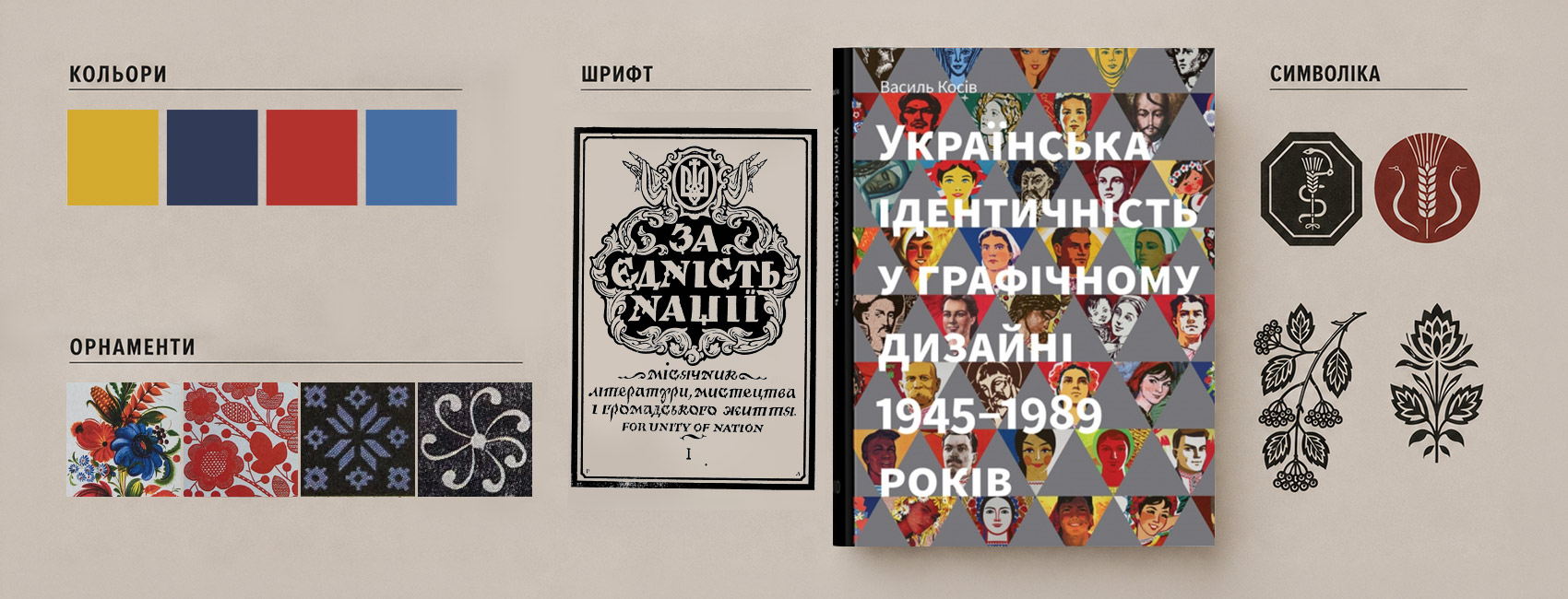

You see an error in the text - select the fragment and press Ctrl + Enter
Ornaments, typefaces, colors, and symbols are not merely graphic elements because they also convey specific meanings. During the Soviet era and in exile, Ukrainian artists developed distinctive designs that expressed the nation’s identity without words. Ukrainian identity emerged within the Soviet Union’s standardized visual system through subtle artistic strategies, coded ethnic motifs, and bold formal experimentation.
This selection examines the symbolism of Ukrainian design through “Ukrainian Identity in Graphic Design, 1945–1989,” written by Vasyl Kosiv and published by Rodovid.
A head of wheat
The head of wheat is a constant in Ukrainian visual art. Known as a symbol of vitality, labor, and the existential foundation of the nation, it appeared in various forms throughout the graphic design of Soviet Ukraine and the Ukrainian diaspora as an emblem of national identity between 1945 and 1989.
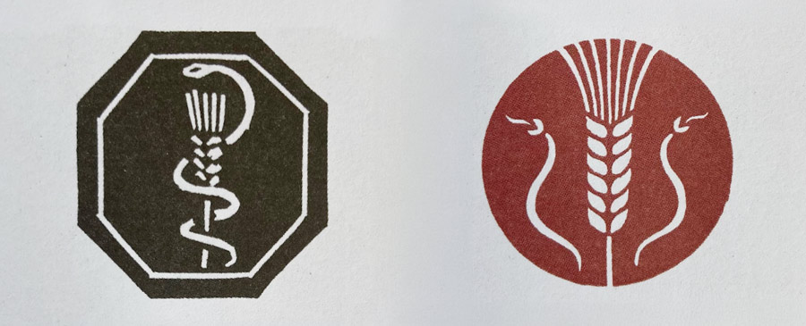
Yakiv Hnizdovskyi made a subtle but effective design decision by replacing the traditional ancient bowl in the veterinarians’ logo with a ripe Ukrainian head of wheat wrapped by a snake. In this way, the professional symbol was transformed into a recognizable manifesto of identity.
Lisovsky’s typeface
Ukrainian graphic identity has its own unique style, the foundation of which was laid by Ukrainian artist Heorhiy Narbut, known for designing the Ukrainian People’s Republic’s coat of arms, banknotes, postage stamps, charters, and for his many illustrations in books and magazines. He combined Cossack Baroque, early printed books, and refined modernism, and thus, the legendary Narbut style was born.
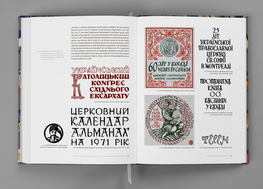
Robert Lisovskyi, Narbut’s student, developed this style further. The cover of “For the Unity of the Nation” features springy, rhythmic letters that vividly embody the national character.
The use of this typeface became a way of declaring this is us. Lisovsky’s lettering evolved into a visual code that identifies Ukrainian art anywhere in the world.
RELATED: Kyiv is hosting an international illustration and design festival
Viburnum
In Ukrainian art, a branch of viburnum has long been a symbol for the continuity of family lines and an enduring identity that has accompanied Ukrainians at home and overseas.
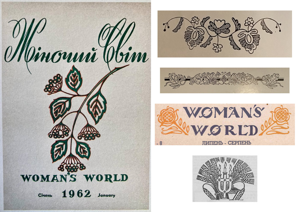
The cover of the 1962 issue of the magazine “Zhinochyi Svit” (Women’s World) features a balanced composition. The delicate, almost weightless calligraphy of the title is paired with a simple branch of berries. As refined as Ukrainian song, it appears to serve as a counterpoint to Soviet monumentality.
Cossack cursive
Cossack cursive symbolizes vitality and freedom. Unlike the imported geometry of the vyaz (an early modern type of Cyrillic decorative writing and typeface) script, for example, cursive has distinctly Cossack origins and a uniquely Ukrainian interpretation. 20th-century artists, from Amvrosii Zhdakha to Edward Kozak in exile, drew inspiration from old hetman decrees and reimagined them as typographic compositions.
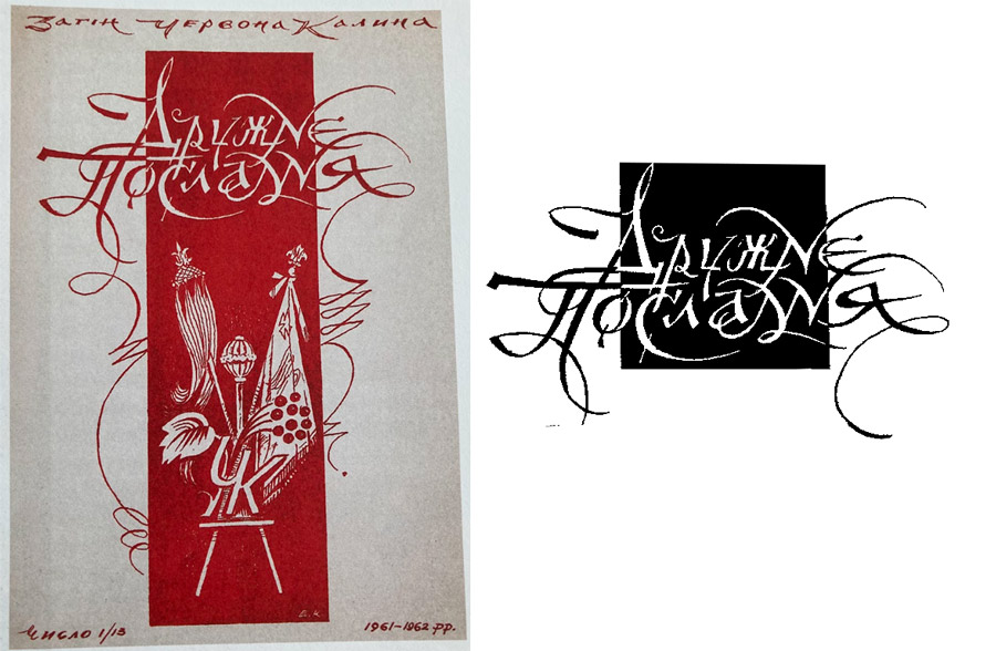
Even without images of regalia or weapons, a cover featuring this script was immediately recognized as Cossack. Cursive became a symbol of inner freedom and artistic expression.
Petrykivka painting
Petrykivka painting is a traditional Ukrainian decorative painting style, originating from Petrykivka in Dnipropetrovsk Oblast, where it was used to decorate house walls and everyday household items. The earliest known examples of this style date to the 18th century, yet it continues to flourish and evolve as a contemporary art form. The distinctive features of this folk art style are flower patterns, distinctive brush techniques, and a traditionally white background. Contemporary painters, however, often work on black, green, red, or blue backgrounds.
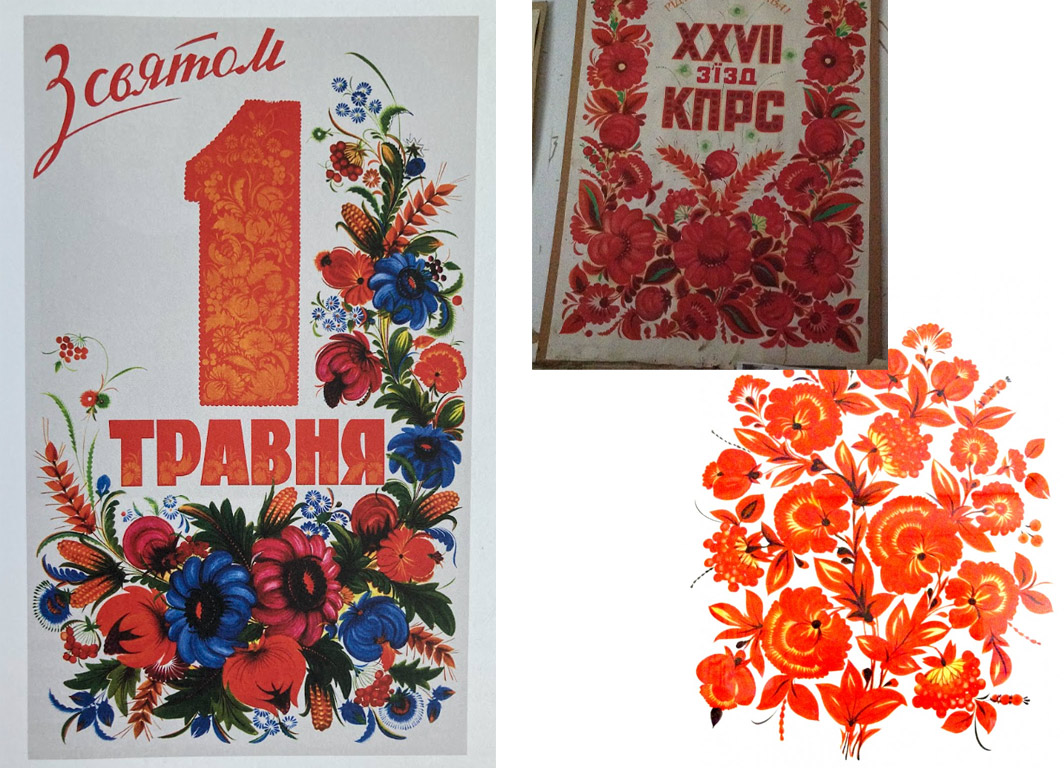
During the Soviet era, poster art was supposed to be standardized and ideological. Ukrainian artists, including Vasyl Sokolenko, a master of Petrykivka painting, discovered an effective way to work within the constraints. In his 1960 May Day poster, the number 1 appears to be “overgrown” with vibrant hollyhocks, viburnum, and heads of grain. These elements symbolize the vitality of life and reflect folk traditions.
While the poster formally met the system’s requirements, its artistic language remained distinctly Ukrainian.
A chessboard-like pattern composed of traditional roses
On the cover of the publication “Ukrainian Music,” the artist constructs the composition as a vibrant geometric tapestry. The figures of the bandura player and dancers are organically woven into a distinct chessboard pattern made up of traditional geometric eight-armed rose (ruzha) stars.
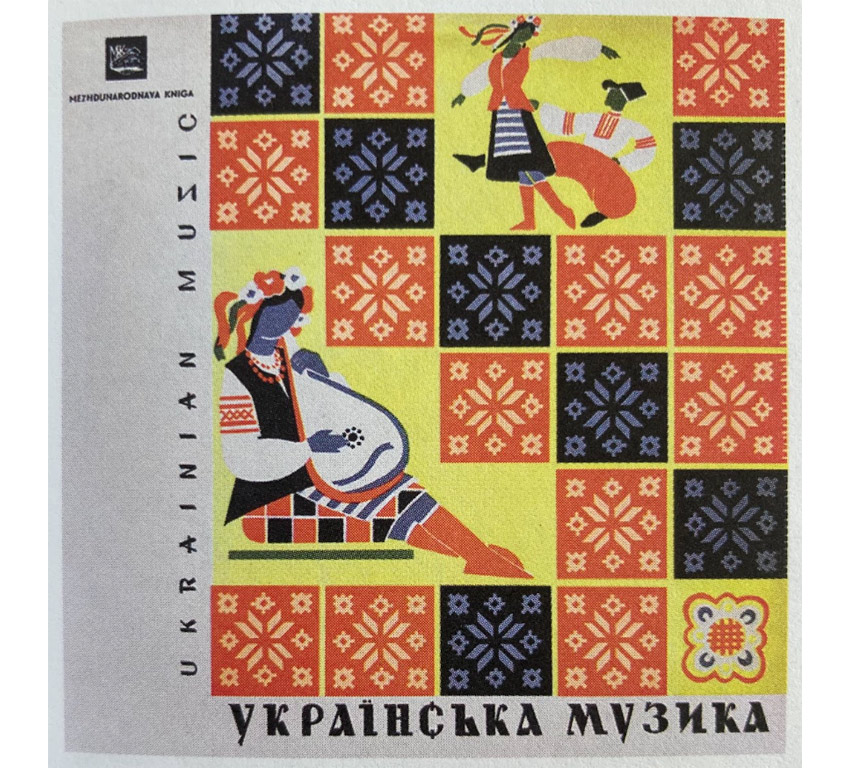
It was a bold combination of folk motifs and the poster-style modernism of the 1960s and 70s. The ethnic ornament, much like a graphic equalizer, creates a sense of rhythm, movement, and the melody of Ukrainian culture.
RELATED: Ukrainian naive mosaics: Searching for the “Chips” of one’s memory
Kyiv 1500 poster
The city’s official Soviet coat of arms, featuring a chestnut leaf, is surrounded by a lush, dense tree of life. Traditional flowerpots, flowers, and botanical motifs literally sprout through the entire composition, symbolizing the continuity of life and the city’s deep historical roots.
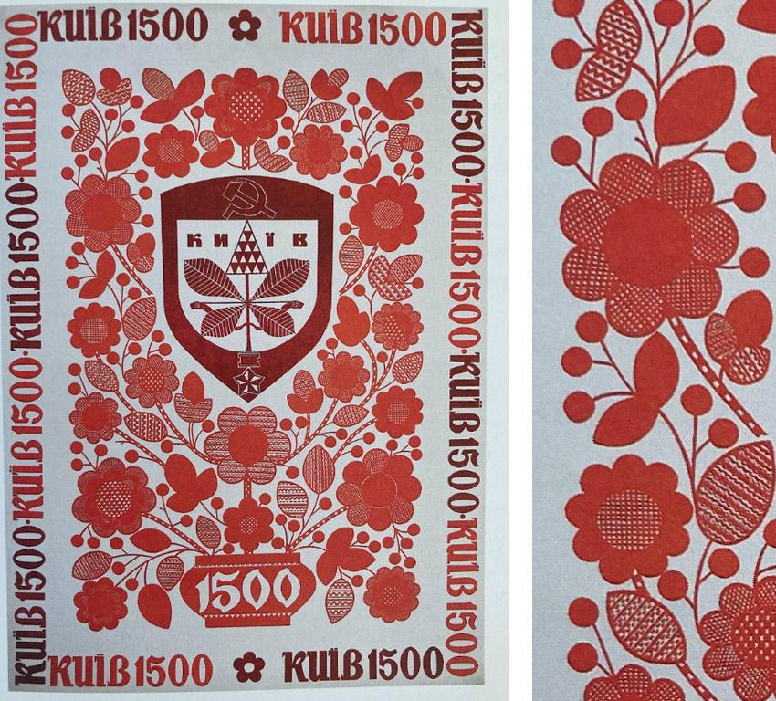
This striking reinterpretation of traditional Ukrainian carpet weaving and book miniatures naturally incorporates Ukrainian motifs.
The Duklia magazine and Lemko symbols
The symbolism in Stepan Hapak’s artwork on the cover of Duklia, a literary magazine for Ukrainians in Slovakia, consists of allusions to motifs from Lemko (Lemkiv) pysanky.
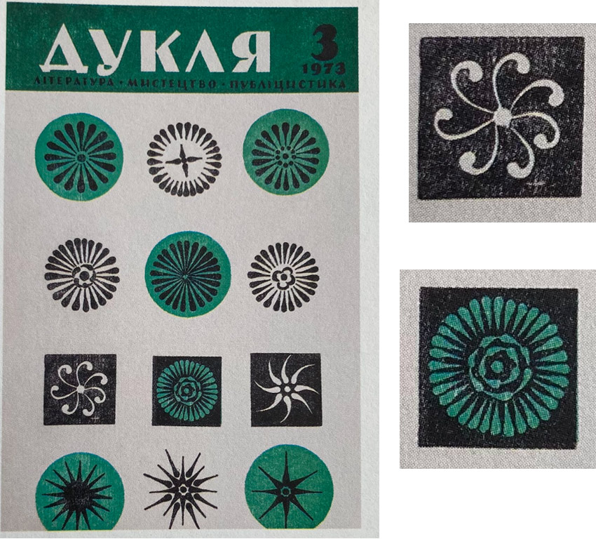
It was a system of minimalist circular and square symbols. These ornaments, made up of elongated drops or strokes, were frequently used in publications connected with Lemko communities, but they represented not only a specific ethnographic group; they also served as a symbol of the Ukrainian community as a whole.
Combination of colors
During the second half of the 20th century, color palettes became the primary visual distinction between Soviet Ukraine and the Ukrainian diaspora. These combinations developed in parallel and never intersected.
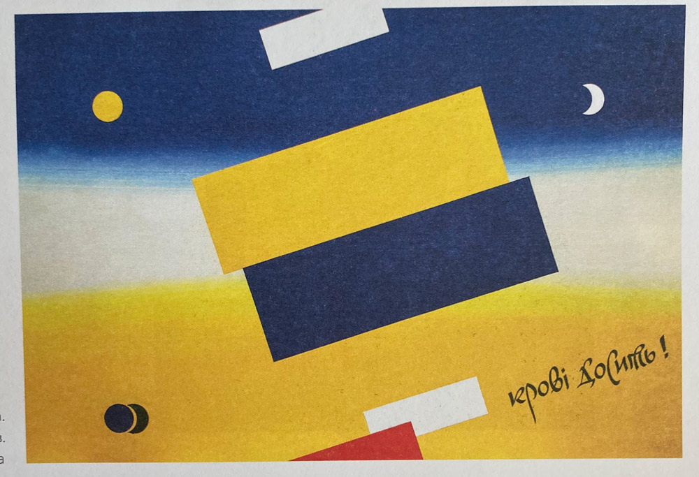
Blue and yellow were freely used during the diaspora in title screens, emblems, and covers. In the Ukrainian Soviet Socialist Republic (USSR), however, this was dangerous, and red and blue were used in graphic design as the official Soviet standard, derived from the republic’s flag.
It was only near the end of perestroika that artists began cautiously reintroducing the blue-and-yellow palette in the USSR. In the poster “Enough Spilling Blood!” Oleksandr Mikula created a suprematist composition in which the aggressive red color appears to have been displaced, leaving only blue and yellow within the frame. Openly depicting the flag was still prohibited, so artists found a creative solution: they balanced the dominance of red by using the natural proportions of blue and yellow in the surrounding environment.
Triangle rapport
In the 20th century, the repeating geometric pattern (rapport) of triangles became a self-sufficient marker of Ukrainian identity, recognizable on its own.
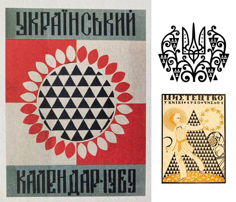
This motif can be attributed to Ukrainian artist and architect Vasyl Krychevskyi. While studying folk embroidery from the Poltava region and embroidered towels from the northern Dnipro Oblast, he identified traditional geometric structures and stylized fruit shaped as triangles.
Artists filled the centers of flowers, architectural details, or the entire background of a composition with triangles and rhombuses. From the 1910s to the 1920s, this technique became a classic, and from 1945 to 1989, it evolved into the most popular means of national identification within the diaspora.
RELATED: Missing in action: Mykola Leonovych on the future of Ukrainian design
The publication is a part of the “Chapter Ukraine” project. The materials have been prepared with the assistance of the Ukrainian Book Institute at the expense of the state budget. The author’s opinion may not coincide with the official position of the Ukrainian Book Institute.
Translation: Iryna Savyuk
Copyediting: Terra King
Читомо» — це медіа про книжки й літературу, що підтримувало українське книговидання задовго до того, як це стало трендом. Ставайте частиною історії — доєднуйтеся до Клубу Читомо!
the more you read, the greater the possibilities