* ESC - close the search window
BOOK DESIGN
Missing in action: Mykola Leonovych on the future of Ukrainian design
01.05.2024
Mykola Leonovych is Ukrainian book designer, poet, and soldier who is currently missing in action. His books have been shortlisted for design competitions every year and have become the face of Ukrainian literature in English translation. His poetry, which has not yet been translated into English, can be read in his collection, “Ahon” (Smoloskyp, 2003), and from his wife, Maryna Aleksandrovych, who regularly posts Mykola’s graphic artwork and poems.
Mykola went missing in action on April 27, 2023 during a mission near Avdiivka on the very first day after his training. We have had no contact with him since then, but we remain hopeful for his return. In this context, we are publishing an interview conducted in the summer of 2022 about Ukrainian book design, which is becoming increasingly recognizable in the world, and, thanks in part to Mykola Leonovych, was becoming increasingly recognizable worldwide.
Mykola, we are waiting for you.
Chytomo: What kind of book design traditions did Ukraine receive as a Soviet inheritance? Can we say that we had any of our own specific features?
Mykola Leonovych: Ukrainian book design inherited just a few typefaces used to print books, the concept of a “book artist,” and the consequences of colonial policy from the Soviets.
Let’s start with the latter: The very word “design” was both appealing and dangerous because it was not Soviet. If there was anywhere that one could find “design,” it was certainly in Moscow. In the late 1970s, a large album was published entitled “The lettering art. Works by Moscow book designers.1959-1974,” compiled by Yevgenia Butorina (a significant number of these designers were of Ukrainian origin). In 1980, nearly a half-century later, a Russian translation of “Ausgewählte Aufsätze über Fragen der Gestalt des Buches und der Typographie” (published in English under the title “The Form of the Book: Essays on the Morality of Good Design”) by Jan Tschichold, a leading 20th-century book designer who was influential in the look of the classic pocketbook, appeared.
Publishing such works in Ukrainian was out of the question – you could read about poster fonts for propaganda and the history of typesetting, but for book design you had to travel to Moscow.
One of the key tasks, and perhaps the only one, that Soviet design had to address was to ensure mass production. Books were used in propaganda work, so they had unusually large print runs. At the same time, due to the planned economy, publications did not compete with each other. Printing houses had a limited set of metal typefaces, and mass-produced books looked stereotypically indistinctive from a typographical perspective.
Instead of book designers, the Soviet Union had “book artists.”
Once again, due to the peculiarities of the system, these could be either people who were reluctant to work or genuinely bright and talented artists. These first and foremost included illustrators, but also typographers and designers who created outstanding publications. For example, the 1968 edition of “Eneida” (“Aeneid”) is iconic not only for its illustrations by Anatolii Bazylevych, but also for the special font created by Vasyl Khomenko.
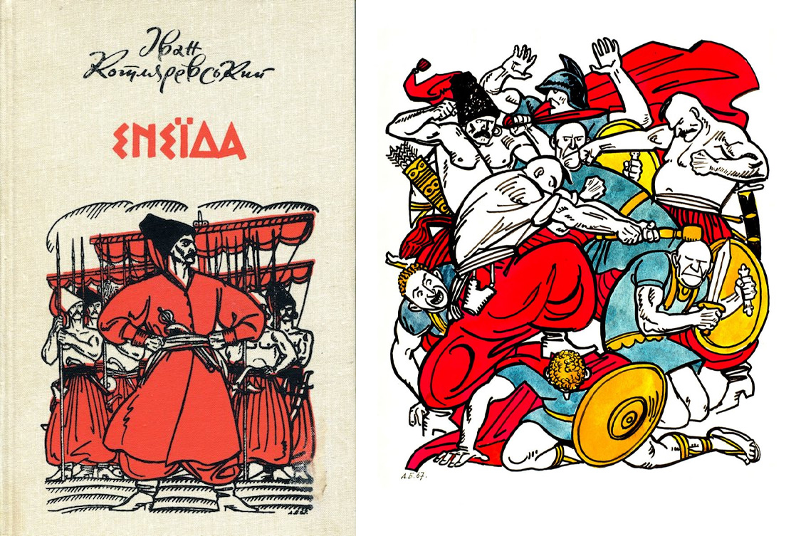
“Eneida” (“Aeneid”) by Ivan Kotliarevskyi, Ukrainian publication
The editions in which Volodymyr Yurchyshyn was involved make a powerful aesthetic impression on anyone who comes across them.
Artists and calligraphers Vitalii Mitchenko and Vasyl Chebanyk, who began their careers in Soviet times, are still active today, influencing contemporary book design through their work and teaching.
At the same time, even in the best cases, a book’s appearance was determined by what was possible. Oftentimes, inserted illustrative elements and high-quality lettering were combined with ordinary typesetting and printing on bulk offset paper.
Chytomo: What was book design like in the 1990s and 2000s? Did it feature anything interesting at all?
Mykola Leonovych: In the first years of Ukraine’s independence, Ukrainian book design continued to develop by inertia. Its strong point was cooperation with highly competent graphic designers. One has only to recall the publications of “Rekreatsii” and “Moscoviada” (published in English under the titles “Recreations” and “The Moscoviad” respectively) by Yuri Andrukhovych with illustrations by Serhiy Yakutovych. However, there was a lack of texts, so many publications from the first decades of the new Ukrainian state are valuable primarily because they existed at all.
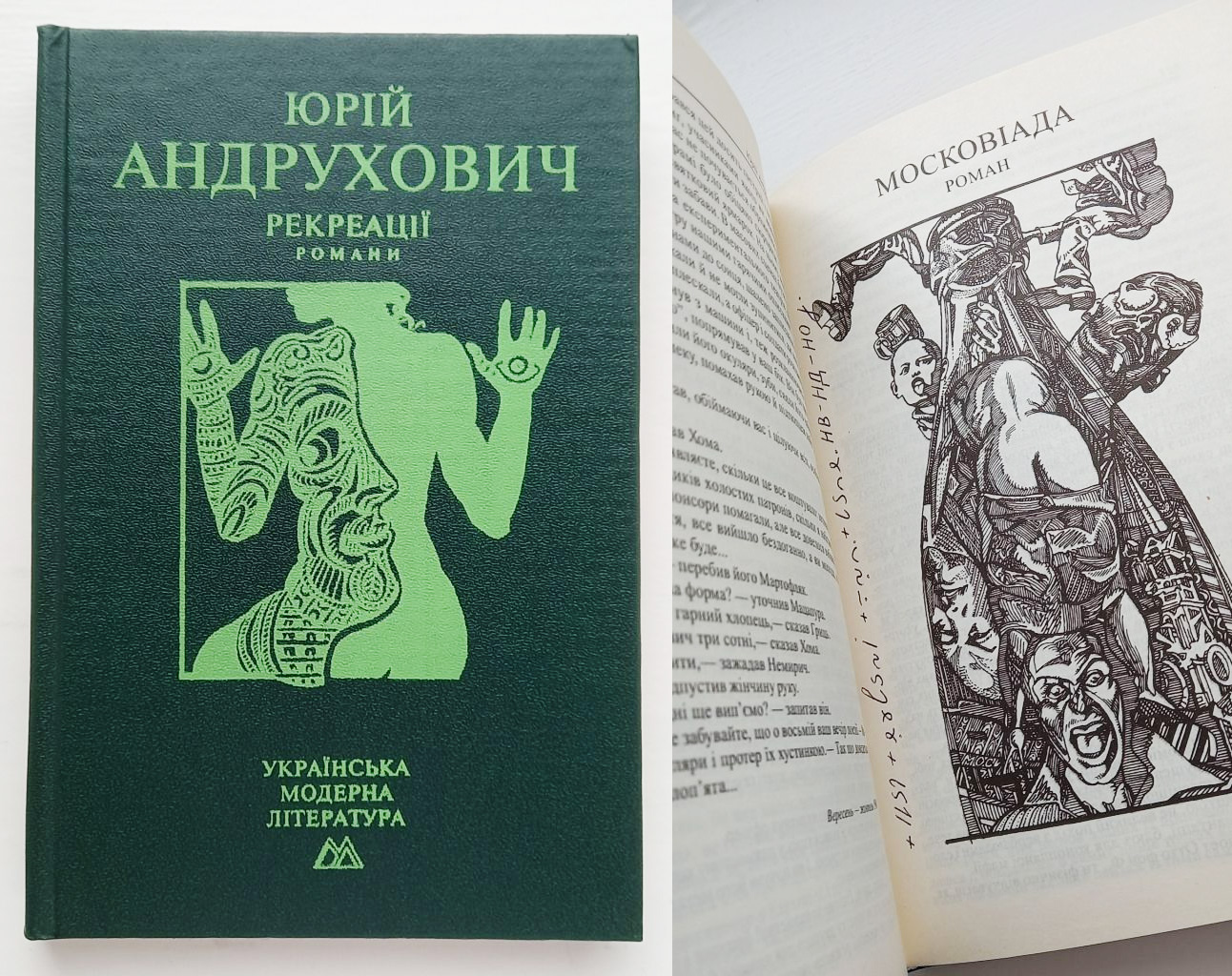
“Rekreatsii” and “Moscoviada” by Yuri Andrukhovych, Ukrainian publication
Parallel to the emergence of new texts and editions, the Soviet vertical network of book distribution completely collapsed. Most bookstores closed. In the capital, there were just two Ukrainian book kiosks in the entire market, and their opening was a real cultural event.
Meanwhile, Russians managed to reprint Milchin’s handbook (a reference book for editors) and translate a number of publications on typography, such as Robert Bringhurst’s “The Elements of Typographical Style.” At the same time, the Russians have flooded the Ukrainian book market with their mass publications.
Chytomo: Has book design in independent Ukraine begun to change at all?
Mykola Leonovych: At that time, the preparation of publications was changing dramatically in terms of technology. You had to hunt for good books, but you could buy a disc with pirated software and thousands of fonts in an underground pedestrian crossing. This is why people who were not afraid to learn new skills began designing books. I’m sure that many designers still use PageMaker (the predecessor of the more modern InDesign).
But I’m not prepared to say that “everything was bad,” because it was at this time that a new type-centric community began to take shape. Festivals in Kharkiv (“Shryftoblok”) and Kyiv Student Gutenberg Festival provided a platform for enthusiasts from all over Ukraine to meet.
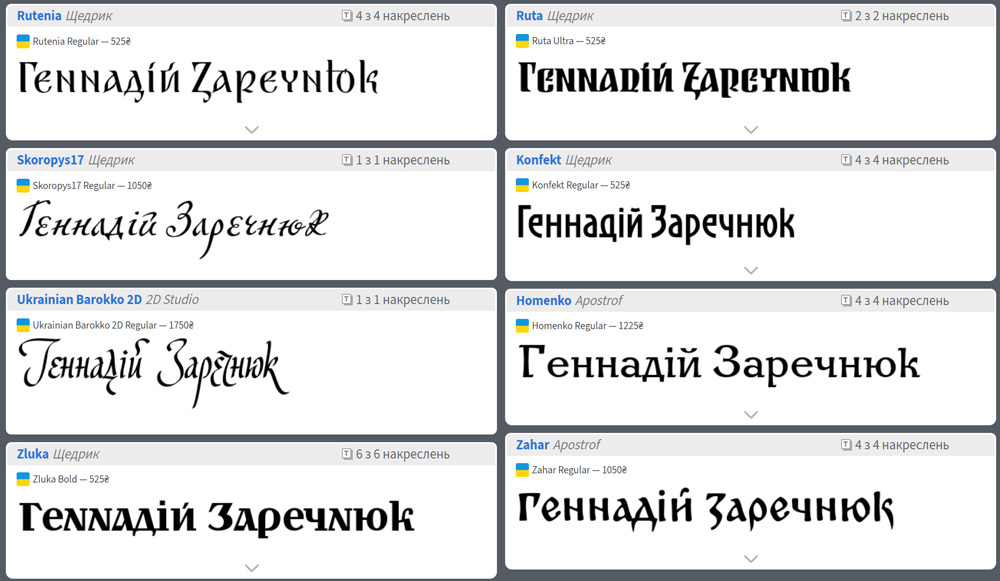
Digital versions of old fonts by Hennadiy Zarechniuk
Thanks to the work of Hennadiy Zarechniuk of Lviv, digital versions of old fonts with a Ukrainian feel have appeared (primarily various letters inspired by the graphics of Heorhiy Narbut, who also revived Khomenko’s typeface). Andriy Shevchenko of Berdiansk and Dmytro Rastvortsev of Sumy were searching for Ukrainian variations of new fonts. And they were not the only ones.
What I most like and even admire about this story is that this community is decentralized. This design is not a product of Kyiv, Kharkiv, Dnipro, or Lviv… It is truly Ukrainian.
These first festivals formed an entire tradition that was only interrupted by the war. For example, Luhansk-based designer Kyrylo Tkachov moved to Lutsk in the early days of Russia’s hybrid war against Ukraine and organized the “Prostir Liter” calligraphy and font festival there. Kyrylo Tkachov is also active as a teacher: While it may be premature to speak of Tkachov’s “school,” the new AlfaBravo type foundry is, in fact, a team of this master and his students.
RELATED: Kyiv Metro is changing the design of station names from a Stalinist to a Ukrainian typeface
Chytomo: Can we say that Ukrainian book design has its own style? Or is it still too early?
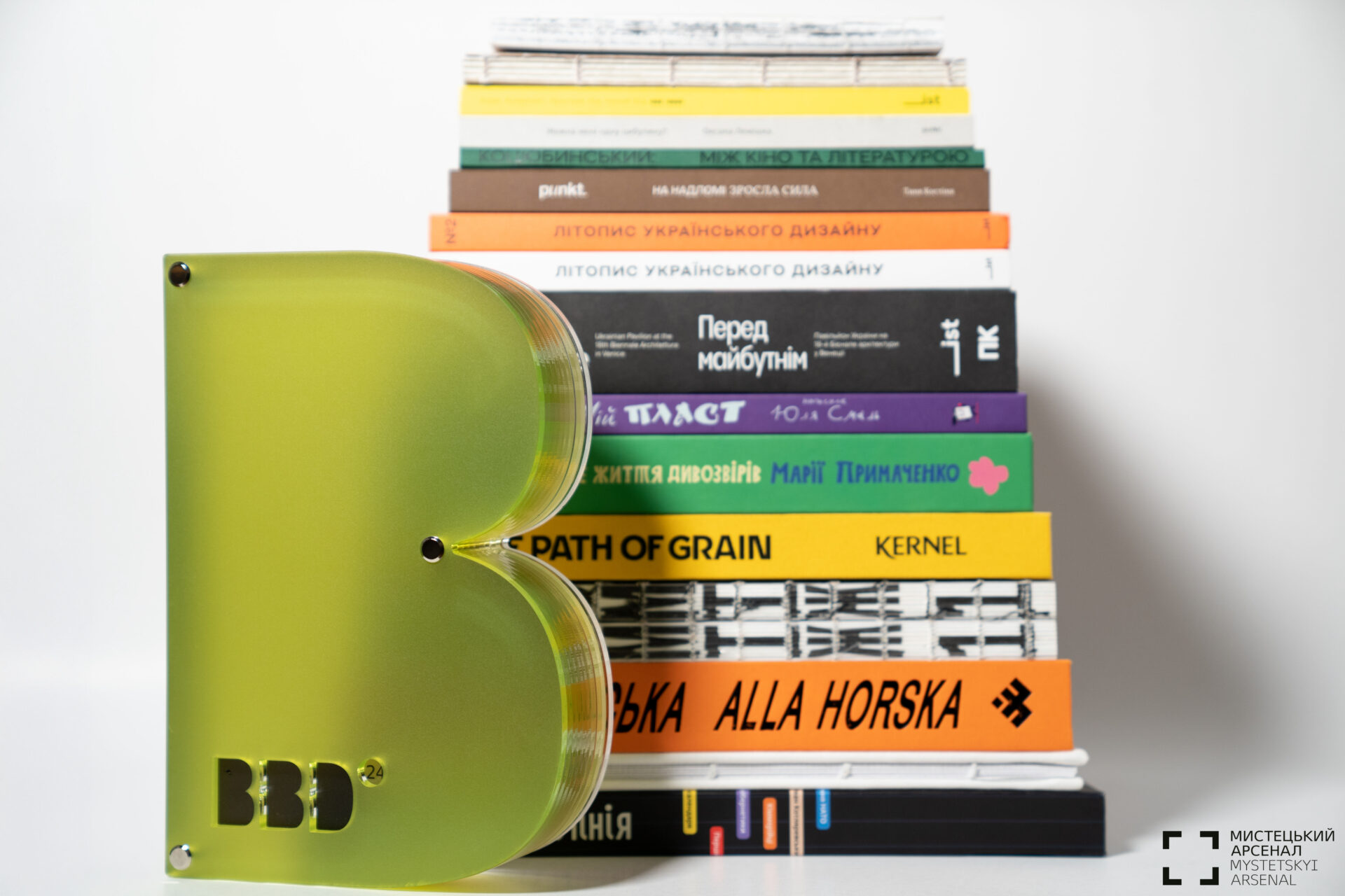
Mykola Leonovych: I believe that the Best Book Design contest has drawn attention to form and contributed to the visibility of designers. It was launched in 2016 by the International Book Arsenal Festival (in cooperation with the Goethe-Institut in Ukraine and with the support of the Frankfurt Book Fair and the Stiftung Buchkunst (German Book Art Foundation). During this time, two somewhat competing trends emerged.
On one hand, illustration remains a very powerful component of Ukrainian books. This is evidenced by the work of illustrator communities such as Agrafka and Pictoric, whose books go beyond the domestic Ukrainian market. At one time, the editorial board of the children’s magazine “Piznaiko” brought together young artists and authors who are now active both in Ukraine and abroad. These include Dmytro Kuzmenko, Inna Cherniak, Zhenya Vasylieva, and their illustrator colleagues.
On the other hand, there are books where for the reader the focus is primarily on typography and working with space. Here we can talk about the Kharkiv School, where books championed by the U,N,A Collective (which includes Aliona Solomadina, Uliana Bychenkova, and Nika Kudinova) and 3Z Studio (Tanya Borzunova, Serhiy Mishakin) are drawing the attention of both readers and fellow designers.
Chytomo: How does colonial heritage influence design now?
Mykola Leonovych: Another trend that has gained momentum is the study of cultural heritage and the departure from colonial space. For example, the consequences of Russia’s long-standing aggressive colonial policy are still reflected in the increased visibility of Russian culture (compared to other neighboring countries). Ukrainian designers of different generations once traveled to Moscow to study and complete internships, and had various creative collaborations (due to the shared Cyrillic script, though differences have also begun to develop at the letter level).
However, in recent years, new fundamental publications have appeared that explore the history of Ukrainian design in different periods. They are perfectly designed and are being released by various publishers. Notable examples include:
- “NARBUT. Studii. Spohady. Lysty” [A Reproduction of the “Narbut Anthology,” destroyed in 1933];
- “ZNAK. Ukrainian Trademarks 1960-1980″;
- Volodymyr Lesniak. “Vidtvorennia shryftovoi spadschyny: 40 oryhinalnykh shryftiv”.
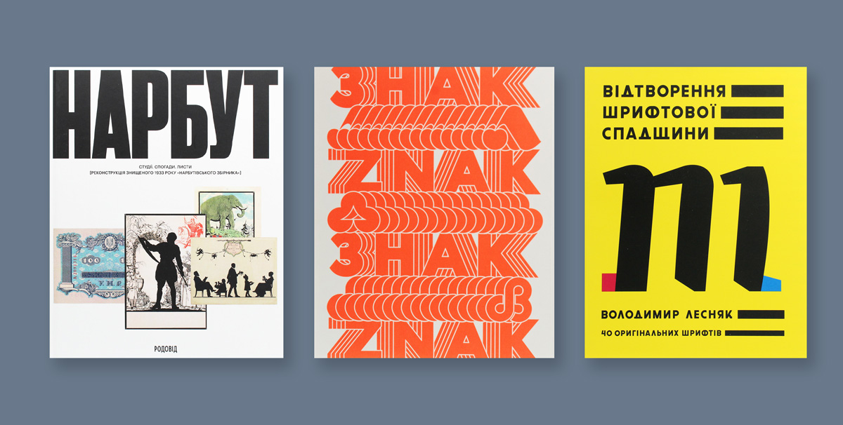
Covers of the publications mentioned above
It is also difficult to overestimate the work of typeface designer Marchela Mozhyna, who is researching the legacy of Ukrainian design in exile (Ukrainian book publishing outside the USSR was active, but remains poorly understood). Marchela locates rare editions, attributes artists and designers, and publishes the results online, engaging the specialist community in research, discussion, and new creative works that resonate with history.
Chytomo: Who is helping to shape Ukrainian book design today?
Mykola Leonovych: Book design itself is quite conservative in our country but is slowly developing and has managed to accumulate many noteworthy details. And when I pick up a book designed by, let’s say, Mykola Kovalchuk or Viktoria Shelest, I feel a sense of elation because everything in their books is as it should be.
I’m a freelance designer, so I know that in practice, smaller publishers are generally more attentive to form. For them, design is undoubtedly a way to increase the competitiveness of their publications.
If we talk about the face of Ukrainian book design, it is shaped primarily by small publishers.
This has been the case since independence, only now there are more of them. At that time, the publications of Lileia-NV (Ivano-Frankivsk) were outstanding, and nowadays there is IST Publishing (Kharkiv), Medusa (Kyiv), and the National Oleksandr Dovzhenko Centre (Kyiv).
But if we imagine that, in addition to a face, there must be a body, then in recent decades Ukrainian “mass-market” books have reached a new qualitative level. One only has to hold publications from 1995 and 2020 side by side to make this difference obvious.
Fortunately, it would be impossible to name in a single sentence all the talented book designers working on very different projects. I’m sure that the work of many of my colleagues such as Yurii Barabash, Lukyan Turetskyi, Serhiy Makarenko, and many others affects not only the outward appearance of the book. Rather, our work is primarily reader-oriented.
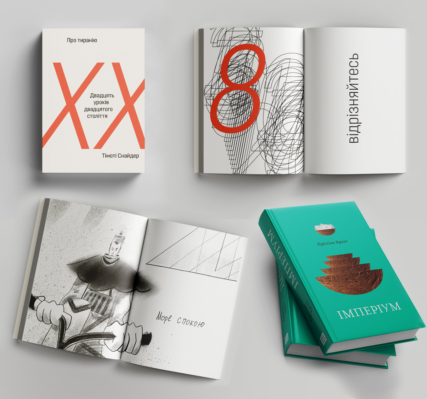
“On Tyranny: Twenty Lessons From the Twentieth Century” by Timothy Snyder
“Imperium” by Christian Kracht
Chytomo: What are the biggest issues in book design in Ukraine? And what could be done to overcome them?
Mykola Leonovych: Right now the biggest problem in book design is Russia’s war against Ukraine. Some of my colleagues are now in the military, others are volunteering. For us, working on new editions is a means of continuing to defy our aggressor. On the flyleaf of the Ukrainian translation of Roland Barthes’s “Camera Lucida” published by the Museum of the Kharkiv School of Photography, there is an inscription: “Printed on Apr. 7 2022 in Kyiv during the Russian war of aggression against Ukrainian independence.”
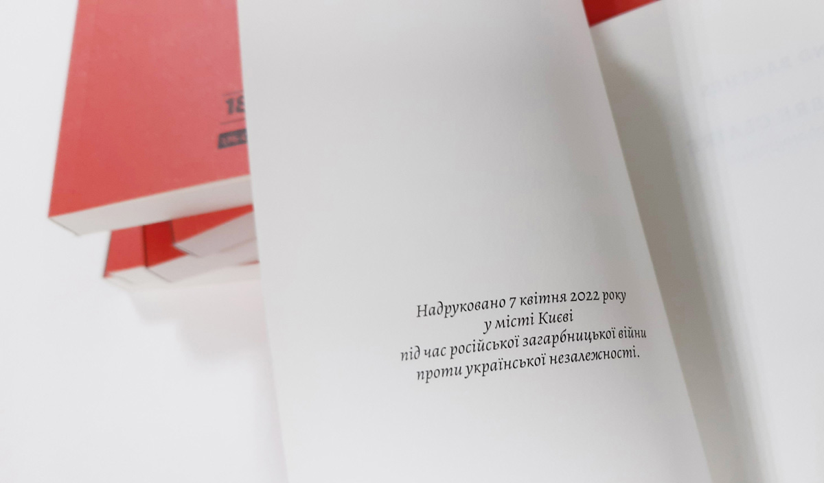
Published on April 7, 2022 in Kyiv amidst Russian aggressive war against Ukraine
Chytomo: What is the place of Ukrainian book design in the international context today?
Mykola Leonovych: Despite the attractive diagrams illustrating page proportions (popularized by Tschichold and Bringhurst), there are no abstract books. Rather, every book is concrete and, in particular, national, right down to the smallest detail. For example, a dash in an English-language book looks different in its British and American editions. The conditions [of the book markets] are also very different: for example, in Ukraine, many creative professionals seek to work for export, whereas in Australia, the work of these professionals is more prestigious and better paid.
However, in my view, establishing contacts and professional communication with European book designers is extremely important. I think we have already started moving in this direction. Specialized festivals in Kyiv and Lutsk attract international speakers with interesting experience. Recently, Ukrainian designer Kateryna Korolevtseva was invited to speak online at the Typographics design festival in New York. Sasha Maslov’s 2020 photo book “Ukrainian Railroad Ladies” received wide international attention, but I think at that time “Ukrainian” was still largely post-Soviet.
Now (because of the war) we are in a time when we have increased visibility. I believe everyone who has the opportunity to speak out should take advantage of it. Ukrainian designers are doing well all over the world, but Ukrainian book design is only possible in an independent Ukraine.
RELATED: Ukrainian book avant-garde from Delaunay to Ekster
Translation: David Joseph Soares
Copy editing: Nicole Yurcaba, Terra Friedman King
This publication is sponsored by the Chytomo’s Patreon community
the more you read, the greater the possibilities

